|
Typically, we compare two colors when checking contrast for accessibility, like the two below. 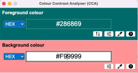 And the reason why we might do that is make sure that we can compare two data elements, like the donut chart below.  While we need to distinguish the two colors for readability and accessibility, we also need to consider...there's a third color. It wasn't until I had an experience of testing two colors for accessibility that I thought, "wait, these colors are going to need to be seen against the background too!" Thus, our third color...our background color. 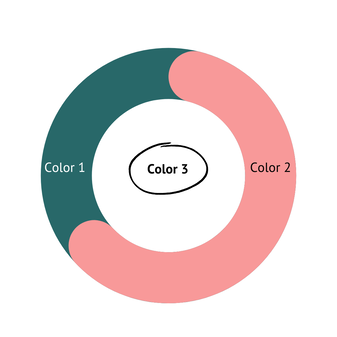 What I've learned is to test the color closest to the background to ensure that the data elements are accessible compared to each other and the background. In this example and from the image below, we can see that there is insufficient contrast between the white background and color/data point 2. 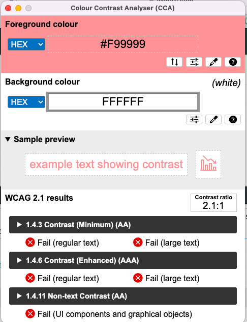 So we need to make an adjustment (maybe that's change the color, outline the color in a darker color, or add markers for the data points---it just depends on what will help the audience read the visualization).
And that's what I learned...check your colors against each other AND the background.
0 Comments
what i've learned (so far) about cognitive load theoryIf you're in the data visualization industry, you may have heard about cognitive load. Cognitive Load (CL) is the amount of work that your working (short-term) memory has to do. What I learned is that the Cognitive Load Theory (CLT) originated as a teaching theory developed by John Sweller.
My knowledge of CLT was basically limited to the definition. But after reading a few articles, my mind was blown at how much I didn't know and how much more there is to know. For example, I learned that there are three (3) types of cognitive load. Intrinsic (how complex the task is) Extraneous (what we are typically concerned with...not letting the extra stuff increase the load) Germane (linking new info to info in our long-term memory) This got me thinking about these concepts in terms of data and data visualization. Intrinsic CL is how complex the domain knowledge or the information underlying the data point is. For example, for someone who is learning about how past due loans relate to bank failures, the concept of solvency ratio might be understood on the surface. But, the data has business logic built in it (like, loans 30 days past due don't have as much risk of causing the bank to lose money versus a loan that is 90 days past due) and all of that (and more) is baked into one ratio. And if all of that made your head spin, then I think that's a good example of intrinsic cognitive load. If you're in lending in banking, then past due loans and solvency might not be that big of a load, but if you're not familiar, then your brain is like: whooaaaaa, you're making me work. Extraneous CL is not letting the noise increase the load. This might be the colors we use, the type of charts, the fonts in data visualization. I think this is might be the easiest for us in data vis to cure. And of course, my accessibility loving heart also likes this because being intentional with what we use in data vis helps create more accessible visualizations. From a data point perspective, I think it might be the extra information behind the data (but this is something I would need to further understand). Germane CL is linking the new information with known info. From a data vis perspective, I think of it like learning about a spike in the trend with what I know what typically happens when spikes occur. Or maybe it's tying what you know about past due loans to how it affects solvency. What struck me was that while I learned something new about the three types of cognitive load and those by itself can be a lot and can be addressed individually, is there a cumulative or exponential effect of two or three of these types of cognitive load? That's something else to learn. To keep in the spirit of trying to not overload your short-term working memory, I'll finish what I learned about cognitive load. 🤓 Reference: Education Corner. Cognitive Load Theory--The Definitive Guide. Loveless, Becton. https://www.educationcorner.com/cognitive-load-theory/ I'm pretty excited because I wanted to share the learnings that I've had in my professional life. I was inspired by Oprah's book, What I Know For Sure, so I decided to blog my learnings in a series I'm calling What I've Learned. I'm envisioning that it will cover everything from my personal lessons learned to Cognitive Load Theory to Accessibility and marketing. I have a love of learning but what good does it do me if I learn it and don't share it?  What I've learned, a blog series
As I was completing Chartability for one of my vizzes, I found myself wondering,
"How do I check for keyboard navigation?" "What's a tab stop?" That's when I reached out to my go-to resource, who seems always willing to help, Frank Elavsky. Here's what I took away from that discussion:
Here are two quick demos of what it looks like on two of my vizzes that were completed in 2020 and 2021. You can see that the border around the focus area is hard to discern from the colors used in the viz. I'll be looking at seeing if/how I can change the border. Try it for yourself and see what happens!
I also put together this speed tip for the #a11ytug which covers what keyboard navigation is, why it's important, how to navigate/test with a keyboard only, and the heuristics from Chartability.
Check it out & let me know if you have any questions! I wrote a little note about why I stepped down, but to save you the aggravation of trying to read my handwriting, I'll type it out for you.
Dear friend(s), Tableau announced the 2022 ambassador cohort and it feels a bit odd not to see my name and picture included. I've been an ambassador since the program started in 2015? and I joked that I saw the cool kids retire from Tableau and thought I should retire too. The reason why I "retired" is that I just don't have the energy and excitement that I had three, four, or even six years ago. And I'm okay with it. It was a hard decision to make but the beautiful thing is that I can contribute whenever and however I want. Here's what this means to me: 1. I created space for someone more diverse and excited. 2. Instead of providing free marketing and community building for Tableau, I get to grow and nurture Pretty Strong Smart and advocate for accessible data experiences. Both of these are huge passions of mine. 3. I have one less thing to stress/spend energy on, which is healthy for me. Some of you might be thinking, "What about TFF?" It's still here & happening. Like always, TFF takes a village and I love how it serves the Tableau community. I feel that this is growth for me and I love it. I can now fill the role of the wacky Aunt to the datafam, whose vibe is somewhere between alpha female and crystal collector and seems to "always be off doing her own thing." Here are the people who helped shape who I am and I'd be remiss if I didn't thank them for their leadership (in no particular order): Elissa Fink, Jackie Yeaney, Andy Kriebel, Anya A'Hearn, Chuck Hooper, Jonathan Drummey, Kelly Martin, Sarah Bartlett, Jordan Scott, and most of all, Matt Francis, who has been my A1 since day 1. I probably missed a ton of people, sorry. As I reflect on where the company was and how it has grown and evolved, it's crazy to see how big it's actually gotten. My hope is that Tableau continues to be a tool that people want to create community of servant leaders around. Emily PS: For the last couple of years, I've recommended that Tableau introduce a HOF for Ambassadors (modeled after the Visionary HOF and for the purpose of recognizing the contributions of long-standing ambassadors and making room for a new cohort of diverse ambassadors without diluting the ambassador population). It hasn't made the cut yet, but I hope one day they'll implement it! Back in 2016, I gave a talk to the internal AARP Tableau meeting called Rookie Mistakes and Resources. I just found a paper copy! of the slides for that talk and after looking at them, I think they're still pretty relevant today. Imagine my excitement, I got my first Tableau project and it's a big deal. I developed a workbook that measures commitments. I collaborated with folks, I got help with the data (since it wasn't readily consumable), I did the work and then it was the big day...I presented to the senior management and the reception was...less than ideal. In fact, it was awful. "How do you read that?" "That number doesn't look right!" "How did you arrive at that?" "There's too much in here." I can recall that meeting like it was yesterday and the talk I got afterwards and how it felt like my career was over. I presented to these senior managers and got crushed. These were not warm and fuzzy people. And I felt alone. No one had my back. My reputation (in a very flat organization) took a major hit. That was my worst Tableau experience ever. After going through something like that, I was (and am) determined for people to have that same experience. Here are my top rookie mistakes and how people can overcome them. too much contentMy mistake One of my biggest mistakes was trying to incorporate everything that management wanted on a dashboard. I didn't push back and tried to please everyone who had a suggestion and as a result, I had too much content and my messaging wasn't clear. Because it was too much, no one could quickly get the message. 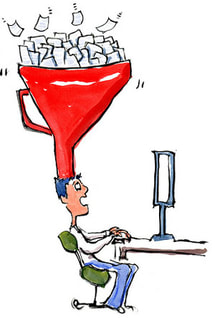 A guy sitting a desktop with a big filter on the top of his head with papers going into the filter. How to overcome Get focused. Ask your audience questions like: "What are the most important items?" "What can be supplemental?" I used the supplemental tactic to create a separator dashboard that just read, "Supplemental Information" and then provided the detail in other worksheets or dashboards that followed. In the talk, I described that I had different workbooks depending on the audience. For senior managers, they just need the high-level view, whereas with the operational folks, I used another workbook that was more detailed and exploratory. data quality/accuracyMy mistake I knew the general concepts but relied on the person that transformed the data in the operational data store for the details. The interesting part is that I contributed to the data, so I understood it at the point of data entry but when it was put in a view that we connected to, I didn't understand what happened. So when I got questions about the data, I couldn't really answer them, which made me look inept. 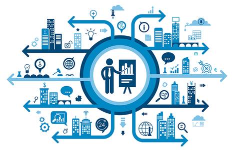 A person with a tie holding a pointer to a graph in the middle of a diagram of buildings, charts, clouds and other images extending out from the middle. How to overcome Dig in and get detailed. Make the data people (if that's not you) explain what happened because it's not a good look for you or them if you can't explain it. But it's not just for management. Management information systems (which Tableau dashboards are a part of), should be timely, accurate, relevant, and complete. By doing the details of the data you can help ensure that these four points are met. AccessorizingMy mistake A powerful tool requires all the things right? Tableau lets me visualize the data as a circle plot, so I'm gonna do it!! I'm gonna zhuzh this dashboard up. Oh... and they need filters, so they can filter for anything they might want to filter for. I think you can see where this is going. 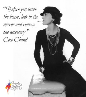 An image of Coco Chanel, with the quote that says: "Before you leave the house, look in the mirror and remove on accessory." How to overcome I started thinking like Coco Chanel. I was accessorizing the data so when I thought I was done, I'd take a look at my dashboard and think, is there something that is extra that needs to be removed? Since this talk in 2016, any time I've taught students, I've used this Coco Chanel approach to dashboarding. Too complexMy mistake "I don't know how to read this chart." Complexity obscured the message. I was showing off my dataviz and Tableau skills and made it too difficult for my audience to understand what I was actually trying to convey.  A silhouette of a head, facing left profile, with a question mark that covers the brain and neck that is made up of different colored bubbles. How to overcome There is beauty in simplicity. Know your audience (KYA)...my audience was that tried and true--read a chart in five seconds kind of audience, so a circle plot when a highlight table would have been so much better, created a bad experience (for them and me). I tried educating the audience on this chart...I tried multiple times. That's when you know that it's your chart, not them. Have the courage to change your chart. I was thinking about the situation I was in all those years ago, I think to myself...how could I have done this differently. This project was in 2011 or 2012, so I didn't really have a network to speak of. There were people who knew how to do Tableau, but they were either unable or unwilling to provide the feedback that I needed to hear. And my supervisor didn't know Tableau or data visualization, so I couldn't go to them for help. The Tableau community isn't any where as big as what it is now, but I wish I had:
And then I thought about what if my chart was actually fine and it was actually them (this wasn't the case, but I imagine someone reading this thinking, but my chart is perfect for the data, what should I do then)? How can I move them to become comfortable with this different chart type. KYA is key. Can I give them a simpler/easy to understand chart now, continue to educate, and then transition them to something more complex? Regardless of whether it's your chart or them, peer review is essential. My biggest mistakes of all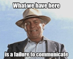 A cowboy against a blue sky in the background with a caption: What we have here is a failure to communicate. Looking back, I think there were two major mistakes (maybe even bigger than the ones listed above).
It's not just meI polled people on the twitters right before my talk about their rookie mistakes. In addition to the results below, I got a lot of "Can I choose all?!" 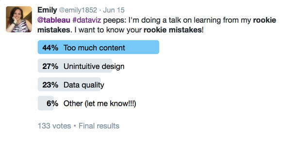 Twitter poll from Jun 15, 2016 that asked, @tableau #dataviz peeps: I'm doing a talk on learning from my rookie mistakes. I want to your rookie mistakes. This is followed by a bar chart that indicates that 44% indicated Too much content, 27% unintuitive design, 23% data quality, or 6% other. This poll received 133 votes. I hope these rookie mistakes resonated with you so that you don't have to go through the pain I went through!
Let me know if this was helpful or what rookie mistake you would add! -Em It's International Women's Day! This year's theme is #breakthebias, so I'm highlighting a few women who have been role models in the Tableau (& a little bit of the dataviz) community in this way. I don't have enough time to highlight everyone (so if there's a woman that wasn't recognized that you think should be, add a comment, tweet this out with your picks).  I will help forge a gender equal world #breakthebias Two women who influenced me (& others) A black and white picture of Kelly Martin, who can be described as a white Canadian woman, wearing a dress with a dark cardigan, and an infectious smile that reaches her closed eyes. A black and white picture of Kelly Martin, who can be described as a white Canadian woman, wearing a dress with a dark cardigan, and an infectious smile that reaches her closed eyes. Kelly Martin Kelly was an awesome person who made people feel welcome and was smart. The type of smart that could talk to the everyday person while also talking to CEOs and the super technical. Kelly created these personal connections so that you instantly became a fan--whether it was of her as a person, her as a woman founder of a dataviz company, or her designs and the technical chops to get it done. Kelly is my person that I look up to and who inspired not just me and Bridget Cogley, but whose influence is still felt, years after her passing. There aren't enough words for me to fan-girl over Kelly. Her work is still relevant today. Check out her site, Viz Candy.  Anya A'Hearn (@AnyaAHearn) Anya is like a cool disruptor to the dataviz scene. I remember meeting her at TCC in DC and thinking, "OMG! Someone has fashion sense and creates these cool data visualizations!" Since I was fun wearing dresses and heels at that conference, I recognized me in her. What I appreciate about Anya, is her ability to be more well-rounded, her ability to prioritize family, and her ability to give "bitchy" feedback that was so useful I still use it today (and for those in the Iron Viz feedback sessions, you'll recognize it as "What's the point? What do you want someone to learn/do after reading your visualization?." I remember when she went from developing these beautiful dashboards to learning even more technical aspects of visualization. And, how she built DataBlick from a one woman show to a team of six, four of whom have been Tableau Zen Masters and one Alteryx Ace. These women worked to forge a gender equal world through the how they work/ed and how they empower women. There are actually a lot of other women that have influenced others and who are helping forge a gender equal world, and I would love to hear about them.
Dear Diary,
2021 was something else both globally and personally. As I see others put forward their look-backs and goals, I thought about mine. There was a lot of things that were 💩 about 2021 for me. I started the year full of hope and then I went on a rollercoaster ride (and I'm like deathly afraid of rollercoasters). In February, I got my first punch to the gut when I was diagnosed with depression. I felt like a failure for not being able to manage my stress. But in typical Em fashion, I developed a three prong approach for overcoming it. Winter rolled into spring and the ups and downs continued. I developed a guided project course for Coursera on how to create an interactive KPI Dashboard in Tableau and wow, was it a lot of work! But also really cool. I also had the opportunity to write a Data Storytelling course, which was amazing! And, I had to make the decision that I needed to be pivot away from being a full-time entrepreneur in my lead generation quiz business. Entrepreneurship was the cause of stress (it's great in so many ways but when you go from a very healthy six figure salary to a moderate five figure income, with recurring expenses holding constant, it was causing more damage to me than I realized). When that decision was made though, it was like a weight had been lifted. And, by the grace of God, I took another look at the Red Hat opportunity that I shared out and thought, "Maybe I could do this!". All of those years of contributing to the Tableau community (along with my work experience), paid off. This is where, if this was a movie, a wise woman would come in and say ,"The reward for unpaid work now will be greater in the future." TBH, I don't watch Hallmark or Lifetime movies, so I can only imagine this is what happens. In April, I joined Red Hat as Principal Business Intelligence Engineer/Tableau Enablement Consultant. Going from government to entrepreneurship to high tech is another rollercoaster, but this is one that I'm actually enjoying. I learn something new about myself and the organization every day. Summertime came and I was invited to be an Advisory Board Member of the Data Leadership Collaborative. This was a dream come true for so many reasons. I LOVE leadership and on mental vision board, I want to a Board member to organizations, so this is a step closer in that direction. Matt and I podcasted one or two times, but it seemed like it was hard to keep going, which was a bummer, but I held out hope. That scary rollercoaster came back over the summer. The family and I went on a proper vacation which was interesting and fun and relaxing (just what I needed). I was appointed the title of All American Mrs. Maryland Woman and then I had another punch to the gut. After seeing a new gastroenterologist and having a scan and later a biopsy, the Non-Alcoholic Fatty Liver Disease (NAFLD) I had progressed and there was a little scarring on my liver (the too long, didn't google version of this is that my liver can gone from presumably healthy a few years ago to fatty liver and enlarged to being extremely fatty and the very beginning stages of being cirrhotic (that's what happens when your liver tissue scars). And finally, some of the other health issues I had were finally explained when a doctor diagnosed me with Fibromyalgia. And the kicker was, no matter what I tried, I couldn't lose the 45 pounds that I gained in an 18 period (BTW, that's not healthy, nor was intentional). I had all of these opinions on how to eat, what to do, and I just wanted to go inward, cry, and shut it all out. However, even though all of this was (and is) a lot to take, I am EXTREMELY thankful for having answers. And I have to say, I put all of this out on the Twitters, because I felt like I didn't have to hide this part of who I am and I feel that psychological safety in my workplace that these issues are just a thing (and not something that precludes me from being a valuable employee). But one of the highlights in spite of all of those health issues, is that I had to the opportunity to an accessibility presentation at the Tableau Conference. This is something that I've been wanting to do since 2016, when my talk didn't get to move forward to the next round. And I had this realization that while I though all of the accessibility advocacy I had been doing was for others--like my daughter or my dad--it was also for me. And that was a major epiphany on how I can reframe how we think about accessibility. This is motivation for the future. There were some other things that happened towards the end of the year (new medicines for Fibromyalgia and one to help with weight), and I got a Peloton (emily1852 is my user name). All positive things! As I reflect back from a data vis perspective, I vizzed a couple of times, didn't podcast, and for the first time since I began the Tableau Fringe Festival, didn't hold a TFF. All of those things bum me out. But as I thought goals for the future, the first thing that I came to mind was being healthy and happy. It sounds very Hallmark, but while there were a lot of punches to the gut, feeling like a failure, having amazing moments, the most prominent guiding principal for me, was: Can I do this and be healthy (eliminate/reduce stress, prioritize myself--which was Dr's orders), and does this make me happy? EVERYTHING else takes a back seat, which is hard for me who always likes to be involved and contributing. And while my thoughts sometimes go back to the failures or the not-enoughness (pretty sure that's not a word, but I'm rolling with it because it describes the thought perfectly), I ended the year happier and healthier than I started it. So when one of my friends in the entrepreneur space was like, what are your business goals for 2022. I was at a loss. And I thought about my data vis goals, and was at a loss. I looked inward and here's what I came up with: Be happy and healthy. If the work doesn't contribute to that, it's a no. For my data vis, continue my accessibility advocacy work. Create more accessible vizzes as part of the Back to Viz Basics project. For data leadership, continue to show up and start sharing more about my leadership experiences. I felt like I wasn't enough, but if I look at my prior work experience combined with now, I am enough. For personal development, complete the two courses in the MS Analytics Georgia Tech Micromasters program and explore marketing analytics. Lean more into who I am. Those goals feel good. And if I achieve them, that will be amazing and if not, then I'm still good enough. When Eric Balash announced that Back 2 Viz Basics was live, I knew immediately I wanted to participate. I'm coming at this community project primarily through an accessibility lens. One thing to note about me is that my current viz vibe is more function over form. Gone, at least for now, are the days of comics and Mother's Day cards in Tableau (if you know me now and didn't know 2014-2015 Em, that's some of what I did back then). Now, I'm all about enabling people to make data experiences accessible to as many people as possible. the entryThe focus for this week was on building your best bar chart using the Thanksgiving data set. 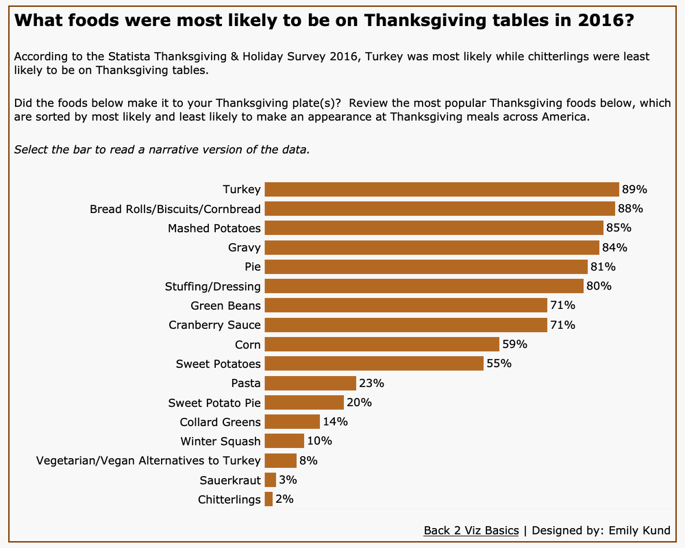 Data visualization that answers the question: What foods were most likely to be on Thanksgiving tables in 2016? The most popular food was turkey at 89% whilst the least popular was chitterlings at 2%. Data visualization that answers the question: What foods were most likely to be on Thanksgiving tables in 2016? The most popular food was turkey at 89% whilst the least popular was chitterlings at 2%. why i did what i didStarting from top to bottom... The title. This data set was from 2016, so I wanted to highlight that. And have the bar chart answer the question what people were putting on their tables. The text/subtitle. I added this concessionary sentence to answer the question to help aid people in reading the visualization. This is also great for the TL;DR (too long; didn't read) folks who want/need the information and they need it now. Italicized text. I added this in because I remember from the full audit of my Disinformation Viz that Frank Elevasky performed that I didn't have instructions to tell someone how to interact with the viz. So, I added simple instructions here. Text size/typeface. I believe all of the text size is 12pt or larger. There's a recommendation that the text size should be 12 pt or larger, but honestly, it's hard for me to always put this in practice since text can be scaled up easily without losing its resolution, which is a requirement of WCAG). I chose Verdana because it's a web-safe font with good spacing and no mirroring or imposter letters. The bar chart. I kept this simple, partially for time, and because simplicity is a great tool for accessibility. I colored the bar chart as the same color of roasted turkey skin (I looked up the color code for roasted turkey skin and used that). That's my bit of flair 🥳. I labeled the bars to help people easily read the length. I was tempted to increase the size or make this more like a silky smooth chart where the data flows (I forget which mark type lets me do that, maybe area??), but I made sure to have enough spacing between the bars so that the data was visually distinct from one item to another. I removed the X-axis because I thought it was unnecessary because of the labels. I think I read something that axes should not be removed, but I need to fully understand the rationale for that one before I implement it (stay tuned). Tooltips. I am a fan of narrative style tool tips (which is my default when I create them), because I'm communicating with a human. I wouldn't shout: Turkey! 89%! so I write a sentence and add the data in there. I was also careful to ensure that the tooltip didn't completely cover the chart.  Link to the data. Back in 2015 (I think), Jock Mackinley talked about data sushi. The data looks great on the outside, but we can see what's in the sushi. The link to the data is the rice, cucumber, and all the yummy stuff. Turns out, it's not just great advice for being able to instill trust or credibility, it's also helpful for those who need to read the underlying data in their own way (even with a screen reader). The background and border. This is my flair. I didn't want a white background, so I looked to a very light shade. I made sure that there was sufficient contrast between the data color and the background and there was. I added a border because to me, it finishes it off. The border is in the same color as the bars. It doesn't add anything and in my opinion, it's not distracting. And that's the viz! Accessibility self-auditI didn't want to spend a lot of time on auditing my viz. That's not because I didn't care, but because I had a ton of stuff to do and I figured, that's most people's day. I took Chartability and used the Chartability workbook (found lower on the page). Instead of using the POUR-CAF approach, I kept this quick audit to POUR. I didn't have a ton of time and I knew that the POUR-Perceivable, Operable, Understandable, and Robust-are common to accessibility standards that currently exist. The CAF-Comprising, Assistive, and Flexible were added as an extension of the Robust concept and are based on inclusive design principles. I plan to go back and do all of the seven principles. My other motivation for only self-auditing based on POUR is that it helps get you started (if you're not already doing self-assessments).
The overall result of my abbreviated self-assessment? My viz is mostly accessible. ⭐️ Note: the self-assessment and accompanying images to demonstrate accessibility will be added shortly (read: they're on my work computer and I need to get the document and images when I get back to the office). All in all, I'm happy I went through process starting with the teaser data, so that I can set the stage for future weeks' work.
When I became an entrepreneur, I realized the importance of email marketing to nurture community and then convert them to clients. There is a huge opportunity here marketing tech help COEs nurtures upskill their community to help them create engaging and informative dashboards. This article will address the what, why, and how of using elements of a martech stack in your COE practice.
But first, what am I talking about when I refer to martech? It's marketing technology like email marketing, quizzes, client relationship management software. So why do you need this martech stack? Have you ever thought of how your wish you had more data on your users to better meet their needs? Are you supporting soooo many users with a lean team and it's tough to manage all the touchpoints? You have allllll the ideas of what you want to do and there's just not enough time between taking care of your community and your other initiatives? Or perhaps your new users don't know how to get started and what some good resources are. Marketing technology allows you to better understand your community to serve them while allowing you to work on other priorities. Before moving on to the thee the how of martech, I want to address a very real concern; data privacy, which some people will say is a reason why they cannot use martech. Specifically, this post will briefly cover GDPR, the (European) General Data Protection Regulation. The spirit and intent of GDPR is to ensure protection and privacy of people's data. As a result, companies took several measures to ensure compliance. In May 2018 when GDPR went into effect, marketing tech companies included GDPR as a consideration when people provide their email address to opt-in to email lists. Additionally, if your company needs to comply with GDPR, they likely have robust data and privacy policies that provide direction and coverage for your COE's activities. GDPR also affords individuals the ability to have their personal records deleted, which you can do. In reviewing the regulations, personal data is defined as any information related to an identified information, for example, an account number or email. Basically, personal data is like personally identifiable information (PII), meaning that used alone or combination with other relevant data, information used to identify a person. What's the bottom line when it comes to PII and GDPR? Your company must comply, but don't think of it as a barrier. Now's a great time for a legal disclaimer. Don't consider this information legal advice, it's just the interpretation and understanding of a former bank examiner who had to supervise banks at the beginning of GDPR implementation. The second reason people may say why they can't implement marketing technologies; their community doesn't want their data collected. This reason is just begging for data collection and analysis. Is that ACTUALLY a reason, or is that just a few people who don't want their data collected? Survey your people to see where they stand and if it is an issue, just share that they'll receive general, not personalized content that would be relevant to them. Now that we've covered why you might use marketing technologies, what they are, and covered data privacy concerns, let's discuss who can use marketing technologies. Do you need to have a multi-million dollar company to use martech? No. I use it with my own company that has revenue of less than $100k. I'll cover costs in this post to also provide you some idea of how a company of any size can use these technologies to their benefit. With as little as $100, you can make a big impact.
A Simple Stack
There are two components to a simple stack; email capture and email marketing. Email capture can be done in a variety of ways: 1. A license request. 2. A sign up form. Got a google form? You can use this to capture emails. 3. A quiz. This is my favorite by far. For a license request and a sign up form, make sure the opt-in is part of the form so that your users consent to receiving updates and tips from your COE on a [insert timeframe here] basis. They should be actively checking a box or entering their name and email, the two most important pieces of information. IKYK that quizzes are an amazing tool for businesses. The reason why is that they help the quiz taker learn more about themselves and they help the business learn more about the quiz taker. Quizzes can also capture emails. Make no mistake, it doesn't have to be a boring quiz. Think of the Buzzfeed style quiz that people love. You can adapt that for your use. Don't worry, this isn't about finding out which Disney princess you are (one of the most popular quizzes of all time). You can create a quiz that will help you assess skill level, for example. Tableau has done this with their learnings paths and the personalized results (recommended paths) are a great example of how the quiz can be used.
The second part of the stack is arguably the most powerful. Email marketing. Only it's not email marketing like businesses use to sell us their goods, we're using it to provide value and "sell" people into the appropriate courses and programs we have developed. Email marketing is performed via an email service provider (ESP), like Mail Chimp, Mailerlite, Salesforce, ConvertKit, etc.
If you use email groups like 'User Group Members' or 'Viz Creators' you might be wondering, "Why can't I just use my groups?" An ESP gives you more flexibility and more power than an email group ever could. With an ESP, you can set up an onboarding sequence when someone gets their license so that you can set your community up for success. And if you have more information about them (say, from a quiz), you can create tags that can be applied to each person. So, if you just need to send your creators who have advanced skills an email? No problem! Want to send beginners a series to email to help them up level? No problem! Want to send user group members who are interested in speaking an email? You guessed it, no problem! As you can see from these examples, you wouldn't create or request all of these groups in outlook/gmail or through your IT. With an ESP, you can deliver more relevant and engaging content that supports your users with what they need and are interested in. At this point, you might be thinking, "this sounds great, but how much does it costs? Can I ACTUALLY get it approved for use? And, will this actually make me more effective or efficient?" The answers are: it doesn't have to cost a lot, you might have to build a case (but hopefully this post will help with that), and yes. Email service providers range in costs from bare-bones free versions like Mail Chimp if your list is small. I actually prefer and recommend Mailerlite because it's cost effective at approximately $120 for a list of up to 1,000 subscribers. There are more expensive ESPs out there and your company may already be using one that you can create a sub-account for. For a quiz, I recommend using a quiz platform, my favorite (and in full transparency, one that I'm a strategic partner with), Interact is a great tool and costs approximately $225/year. The total monetary costs per year for this simple stack starts at $345 per year. Totally reasonable! Will these tools make you more efficient and effective? When used correctly, yes. Imagine all the data you can collect without having to a lot of unnecessary interviews (save those interviews for when they're really needed). The cost of confusion and multi-tasking can be high. You don't want your users to be confused on their Dataviz journey, so providing them the resources they needed in a scheduled, automated means, is helpful for them and you...so that you can help users with real-time problems or work on priorities without having to answer emails around how people can get started. Depending on your organization, you may need to build a business case for these tools. That's a great opportunity to flesh out your strategy to ensure it's right for you, but hopefully all of the information in this introductory article can help you build a business case. I'll plan to delve into each of these tools in future posts, but if you have any questions, feel free to ask! PS: This post contains affiliated link. It's no additional cost to you and if you want a comparison of different tools, I'm happy to help. |
Emily KundHelping people and organizations begin their data visualization and Tableau journey. I'm a fan of training, Tableau, data viz, my kids, cupcakes, and karate. Archives
September 2022
Categories
All
|
 RSS Feed
Proudly powered by Weebly