|
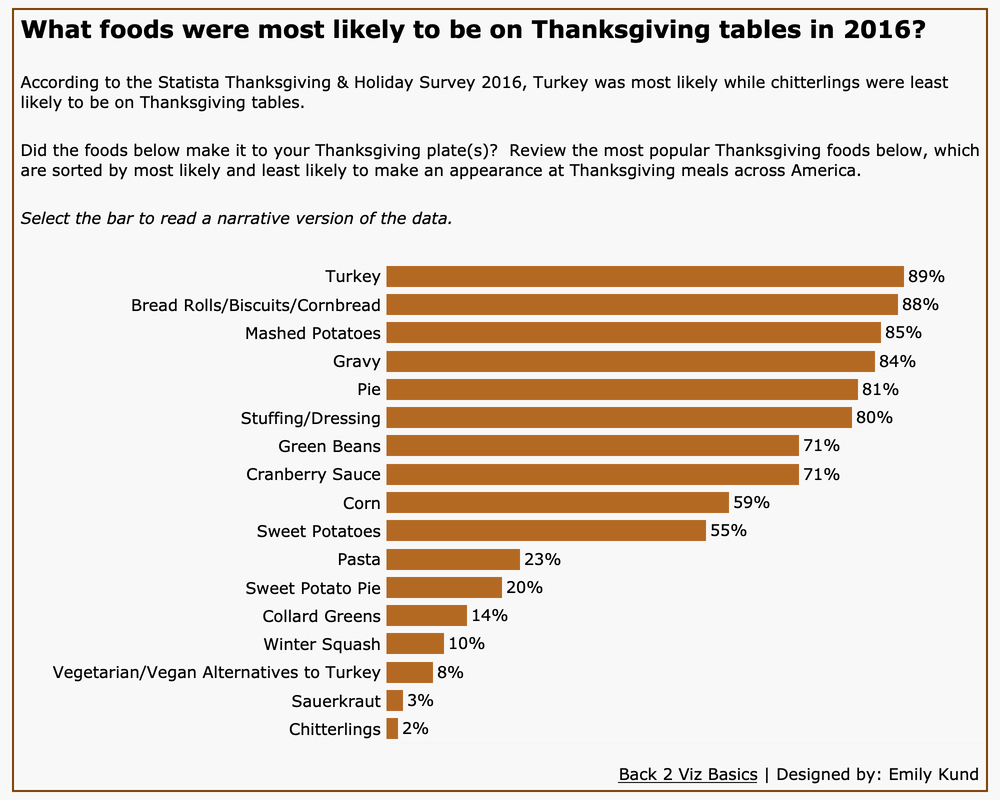
When Eric Balash announced that Back 2 Viz Basics was live, I knew immediately I wanted to participate. I'm coming at this community project primarily through an accessibility lens. One thing to note about me is that my current viz vibe is more function over form. Gone, at least for now, are the days of comics and Mother's Day cards in Tableau (if you know me now and didn't know 2014-2015 Em, that's some of what I did back then). Now, I'm all about enabling people to make data experiences accessible to as many people as possible. the entryThe focus for this week was on building your best bar chart using the Thanksgiving data set.  Data visualization that answers the question: What foods were most likely to be on Thanksgiving tables in 2016? The most popular food was turkey at 89% whilst the least popular was chitterlings at 2%. Data visualization that answers the question: What foods were most likely to be on Thanksgiving tables in 2016? The most popular food was turkey at 89% whilst the least popular was chitterlings at 2%. why i did what i didStarting from top to bottom... The title. This data set was from 2016, so I wanted to highlight that. And have the bar chart answer the question what people were putting on their tables. The text/subtitle. I added this concessionary sentence to answer the question to help aid people in reading the visualization. This is also great for the TL;DR (too long; didn't read) folks who want/need the information and they need it now. Italicized text. I added this in because I remember from the full audit of my Disinformation Viz that Frank Elevasky performed that I didn't have instructions to tell someone how to interact with the viz. So, I added simple instructions here. Text size/typeface. I believe all of the text size is 12pt or larger. There's a recommendation that the text size should be 12 pt or larger, but honestly, it's hard for me to always put this in practice since text can be scaled up easily without losing its resolution, which is a requirement of WCAG). I chose Verdana because it's a web-safe font with good spacing and no mirroring or imposter letters. The bar chart. I kept this simple, partially for time, and because simplicity is a great tool for accessibility. I colored the bar chart as the same color of roasted turkey skin (I looked up the color code for roasted turkey skin and used that). That's my bit of flair 🥳. I labeled the bars to help people easily read the length. I was tempted to increase the size or make this more like a silky smooth chart where the data flows (I forget which mark type lets me do that, maybe area??), but I made sure to have enough spacing between the bars so that the data was visually distinct from one item to another. I removed the X-axis because I thought it was unnecessary because of the labels. I think I read something that axes should not be removed, but I need to fully understand the rationale for that one before I implement it (stay tuned). Tooltips. I am a fan of narrative style tool tips (which is my default when I create them), because I'm communicating with a human. I wouldn't shout: Turkey! 89%! so I write a sentence and add the data in there. I was also careful to ensure that the tooltip didn't completely cover the chart. Link to the data. Back in 2015 (I think), Jock Mackinley talked about data sushi. The data looks great on the outside, but we can see what's in the sushi. The link to the data is the rice, cucumber, and all the yummy stuff. Turns out, it's not just great advice for being able to instill trust or credibility, it's also helpful for those who need to read the underlying data in their own way (even with a screen reader). The background and border. This is my flair. I didn't want a white background, so I looked to a very light shade. I made sure that there was sufficient contrast between the data color and the background and there was. I added a border because to me, it finishes it off. The border is in the same color as the bars. It doesn't add anything and in my opinion, it's not distracting. And that's the viz! Accessibility self-auditI didn't want to spend a lot of time on auditing my viz. That's not because I didn't care, but because I had a ton of stuff to do and I figured, that's most people's day. I took Chartability and used the Chartability workbook (found lower on the page). Instead of using the POUR-CAF approach, I kept this quick audit to POUR. I didn't have a ton of time and I knew that the POUR-Perceivable, Operable, Understandable, and Robust-are common to accessibility standards that currently exist. The CAF-Comprising, Assistive, and Flexible were added as an extension of the Robust concept and are based on inclusive design principles. I plan to go back and do all of the seven principles. My other motivation for only self-auditing based on POUR is that it helps get you started (if you're not already doing self-assessments).
The overall result of my abbreviated self-assessment? My viz is mostly accessible. ⭐️ Note: the self-assessment and accompanying images to demonstrate accessibility will be added shortly (read: they're on my work computer and I need to get the document and images when I get back to the office). All in all, I'm happy I went through process starting with the teaser data, so that I can set the stage for future weeks' work.
1 Comment
|
Emily KundHelping people and organizations begin their data visualization and Tableau journey. I'm a fan of training, Tableau, data viz, my kids, cupcakes, and karate. Archives
January 2023
Categories
All
|

 RSS Feed