|
Back in 2016, I gave a talk to the internal AARP Tableau meeting called Rookie Mistakes and Resources. I just found a paper copy! of the slides for that talk and after looking at them, I think they're still pretty relevant today. Imagine my excitement, I got my first Tableau project and it's a big deal. I developed a workbook that measures commitments. I collaborated with folks, I got help with the data (since it wasn't readily consumable), I did the work and then it was the big day...I presented to the senior management and the reception was...less than ideal. In fact, it was awful. "How do you read that?" "That number doesn't look right!" "How did you arrive at that?" "There's too much in here." I can recall that meeting like it was yesterday and the talk I got afterwards and how it felt like my career was over. I presented to these senior managers and got crushed. These were not warm and fuzzy people. And I felt alone. No one had my back. My reputation (in a very flat organization) took a major hit. That was my worst Tableau experience ever. After going through something like that, I was (and am) determined for people to have that same experience. Here are my top rookie mistakes and how people can overcome them. too much contentMy mistake One of my biggest mistakes was trying to incorporate everything that management wanted on a dashboard. I didn't push back and tried to please everyone who had a suggestion and as a result, I had too much content and my messaging wasn't clear. Because it was too much, no one could quickly get the message. 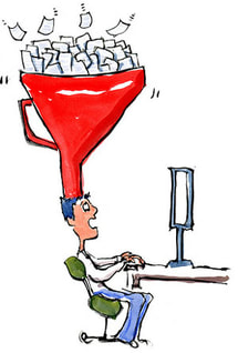 A guy sitting a desktop with a big filter on the top of his head with papers going into the filter. How to overcome Get focused. Ask your audience questions like: "What are the most important items?" "What can be supplemental?" I used the supplemental tactic to create a separator dashboard that just read, "Supplemental Information" and then provided the detail in other worksheets or dashboards that followed. In the talk, I described that I had different workbooks depending on the audience. For senior managers, they just need the high-level view, whereas with the operational folks, I used another workbook that was more detailed and exploratory. data quality/accuracyMy mistake I knew the general concepts but relied on the person that transformed the data in the operational data store for the details. The interesting part is that I contributed to the data, so I understood it at the point of data entry but when it was put in a view that we connected to, I didn't understand what happened. So when I got questions about the data, I couldn't really answer them, which made me look inept.  A person with a tie holding a pointer to a graph in the middle of a diagram of buildings, charts, clouds and other images extending out from the middle. How to overcome Dig in and get detailed. Make the data people (if that's not you) explain what happened because it's not a good look for you or them if you can't explain it. But it's not just for management. Management information systems (which Tableau dashboards are a part of), should be timely, accurate, relevant, and complete. By doing the details of the data you can help ensure that these four points are met. AccessorizingMy mistake A powerful tool requires all the things right? Tableau lets me visualize the data as a circle plot, so I'm gonna do it!! I'm gonna zhuzh this dashboard up. Oh... and they need filters, so they can filter for anything they might want to filter for. I think you can see where this is going. 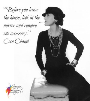 An image of Coco Chanel, with the quote that says: "Before you leave the house, look in the mirror and remove on accessory." How to overcome I started thinking like Coco Chanel. I was accessorizing the data so when I thought I was done, I'd take a look at my dashboard and think, is there something that is extra that needs to be removed? Since this talk in 2016, any time I've taught students, I've used this Coco Chanel approach to dashboarding. Too complexMy mistake "I don't know how to read this chart." Complexity obscured the message. I was showing off my dataviz and Tableau skills and made it too difficult for my audience to understand what I was actually trying to convey.  A silhouette of a head, facing left profile, with a question mark that covers the brain and neck that is made up of different colored bubbles. How to overcome There is beauty in simplicity. Know your audience (KYA)...my audience was that tried and true--read a chart in five seconds kind of audience, so a circle plot when a highlight table would have been so much better, created a bad experience (for them and me). I tried educating the audience on this chart...I tried multiple times. That's when you know that it's your chart, not them. Have the courage to change your chart. I was thinking about the situation I was in all those years ago, I think to myself...how could I have done this differently. This project was in 2011 or 2012, so I didn't really have a network to speak of. There were people who knew how to do Tableau, but they were either unable or unwilling to provide the feedback that I needed to hear. And my supervisor didn't know Tableau or data visualization, so I couldn't go to them for help. The Tableau community isn't any where as big as what it is now, but I wish I had:
And then I thought about what if my chart was actually fine and it was actually them (this wasn't the case, but I imagine someone reading this thinking, but my chart is perfect for the data, what should I do then)? How can I move them to become comfortable with this different chart type. KYA is key. Can I give them a simpler/easy to understand chart now, continue to educate, and then transition them to something more complex? Regardless of whether it's your chart or them, peer review is essential. My biggest mistakes of all A cowboy against a blue sky in the background with a caption: What we have here is a failure to communicate. Looking back, I think there were two major mistakes (maybe even bigger than the ones listed above).
It's not just meI polled people on the twitters right before my talk about their rookie mistakes. In addition to the results below, I got a lot of "Can I choose all?!" 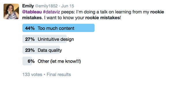 Twitter poll from Jun 15, 2016 that asked, @tableau #dataviz peeps: I'm doing a talk on learning from my rookie mistakes. I want to your rookie mistakes. This is followed by a bar chart that indicates that 44% indicated Too much content, 27% unintuitive design, 23% data quality, or 6% other. This poll received 133 votes. I hope these rookie mistakes resonated with you so that you don't have to go through the pain I went through!
Let me know if this was helpful or what rookie mistake you would add! -Em
2 Comments
It's International Women's Day! This year's theme is #breakthebias, so I'm highlighting a few women who have been role models in the Tableau (& a little bit of the dataviz) community in this way. I don't have enough time to highlight everyone (so if there's a woman that wasn't recognized that you think should be, add a comment, tweet this out with your picks). 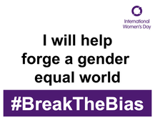 I will help forge a gender equal world #breakthebias Two women who influenced me (& others) A black and white picture of Kelly Martin, who can be described as a white Canadian woman, wearing a dress with a dark cardigan, and an infectious smile that reaches her closed eyes. A black and white picture of Kelly Martin, who can be described as a white Canadian woman, wearing a dress with a dark cardigan, and an infectious smile that reaches her closed eyes. Kelly Martin Kelly was an awesome person who made people feel welcome and was smart. The type of smart that could talk to the everyday person while also talking to CEOs and the super technical. Kelly created these personal connections so that you instantly became a fan--whether it was of her as a person, her as a woman founder of a dataviz company, or her designs and the technical chops to get it done. Kelly is my person that I look up to and who inspired not just me and Bridget Cogley, but whose influence is still felt, years after her passing. There aren't enough words for me to fan-girl over Kelly. Her work is still relevant today. Check out her site, Viz Candy.  Anya A'Hearn (@AnyaAHearn) Anya is like a cool disruptor to the dataviz scene. I remember meeting her at TCC in DC and thinking, "OMG! Someone has fashion sense and creates these cool data visualizations!" Since I was fun wearing dresses and heels at that conference, I recognized me in her. What I appreciate about Anya, is her ability to be more well-rounded, her ability to prioritize family, and her ability to give "bitchy" feedback that was so useful I still use it today (and for those in the Iron Viz feedback sessions, you'll recognize it as "What's the point? What do you want someone to learn/do after reading your visualization?." I remember when she went from developing these beautiful dashboards to learning even more technical aspects of visualization. And, how she built DataBlick from a one woman show to a team of six, four of whom have been Tableau Zen Masters and one Alteryx Ace. These women worked to forge a gender equal world through the how they work/ed and how they empower women. There are actually a lot of other women that have influenced others and who are helping forge a gender equal world, and I would love to hear about them.
|
Emily KundHelping people and organizations begin their data visualization and Tableau journey. I'm a fan of training, Tableau, data viz, my kids, cupcakes, and karate. Archives
January 2023
Categories
All
|
 RSS Feed
Proudly powered by Weebly