|
Recently, I've been doing some practice with chart types I haven't used in awhile, so when I saw Cole Knaflic's Storytelling with Data Challenge this month, I decided to give it a go. The challenge for June was to create a slopegraph. While the data I have been working with recently hasn't been suited for a slopegraph, I do think they are a nice way to see the difference. Here's my original table of data that I made up.  If my goal is to figure out which jewelry division increased the most or had a negative change, I need to do calculations in my head to get the answer I'm looking for. That takes precious time that could be spent making the decision or implementing actions. This data is perfectly suited for the a slopegraph because I'm measuring two periods, so I should be able to see the change clearly. Here are two versions of this data visualization, one with only the visualization and one with a small amount of text to inform the reader about a decision on where to focus. I can now clearly see:
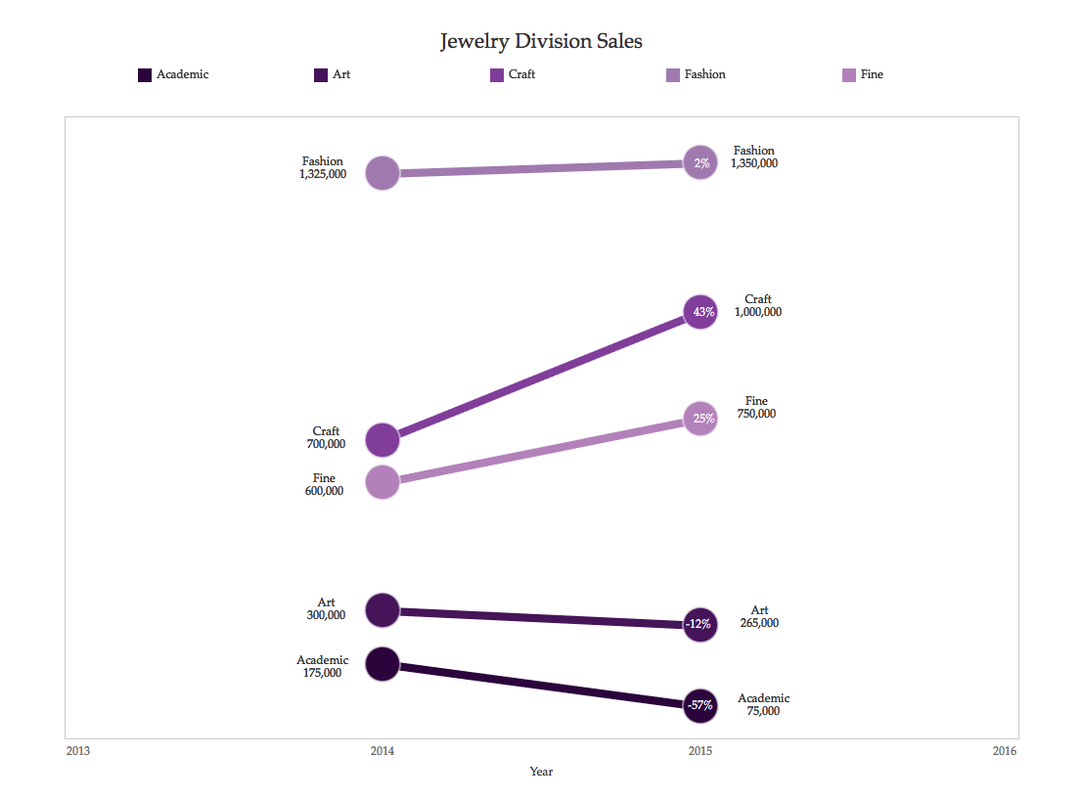 A little narrative can go a long way in facilitating or communicating decisions. 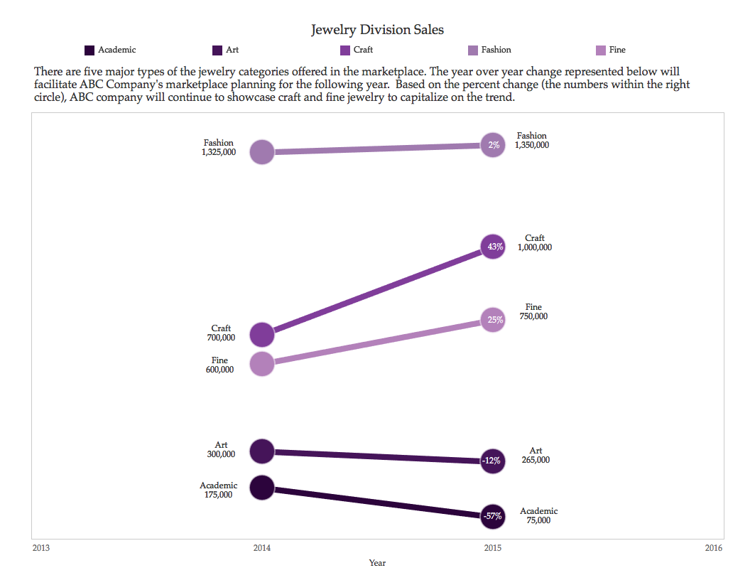 For this example, I used Tableau software and have provided the completely fictional data below if you would like to use it.
1 Comment
|
Emily KundHelping people and organizations begin their data visualization and Tableau journey. I'm a fan of training, Tableau, data viz, my kids, cupcakes, and karate. Archives
January 2023
Categories
All
|
||
 RSS Feed
Proudly powered by Weebly