|
The best reason to use visual analytics is that the picture can tell data's story. It can uncover relationships between data and help show outliers that might otherwise be difficult to see. However, a visual may not be enough, depending on the reader. Adding a little text can help in understanding the message. Take this visualization for example. 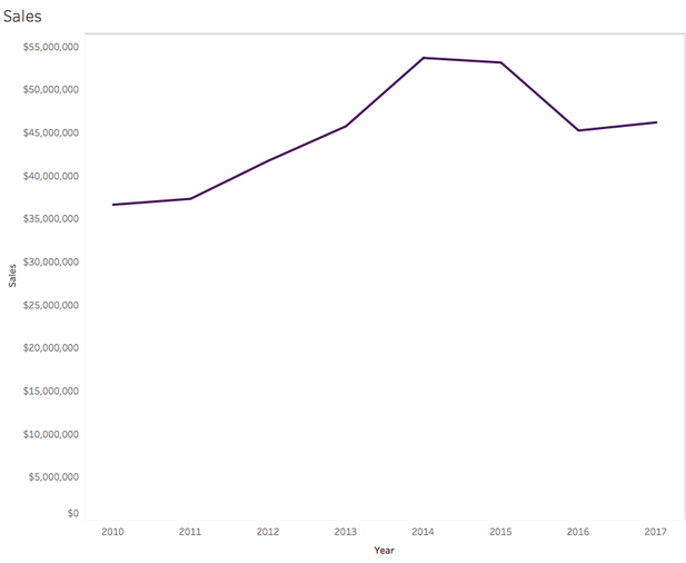 We clearly see there was a downturn in sales, which makes the reader curious about why it happened. The visualization though, does not give the answer. However, if I add one sentence about a change in the pricing model, we can immediately understand why, at least at a surface level. 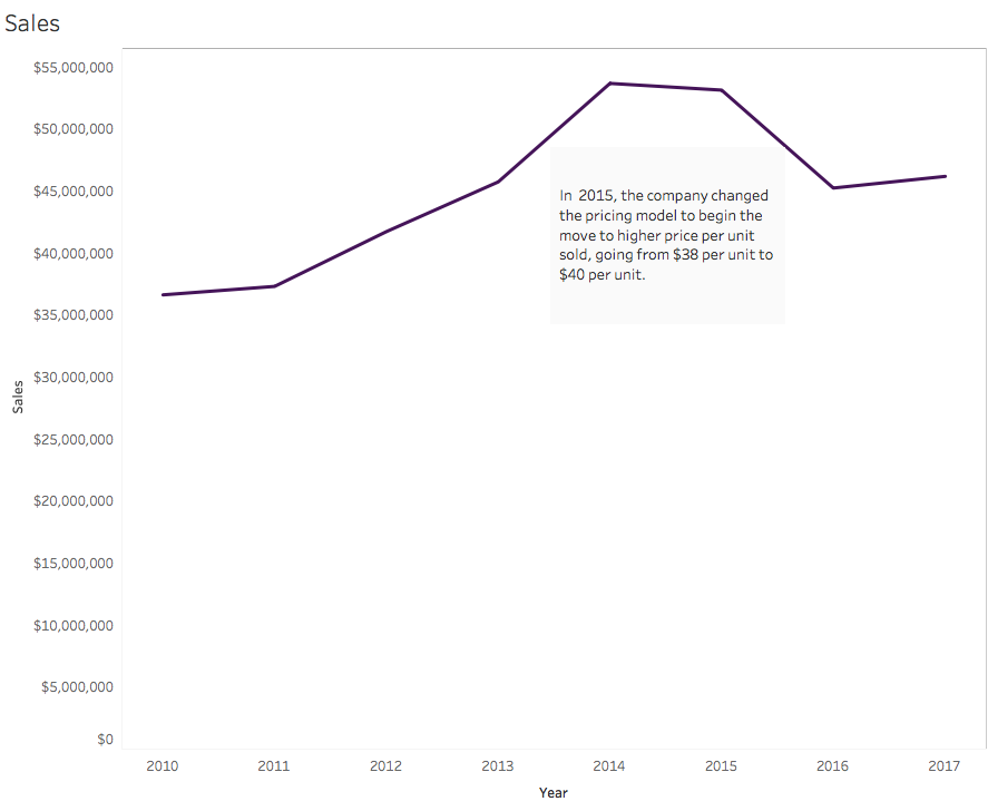  I think we've all been in business settings where we are handed a graph and asked, "What is this telling us?" And I'm sure we've all have had that momentary thought of "I don't have a clue." Why make our readers work harder than what they need to? Unless a visualization is exploratory, the real work should come in at the decision-making process. To help the reader get to the conclusion/decision quicker, the following types of annotation can help.
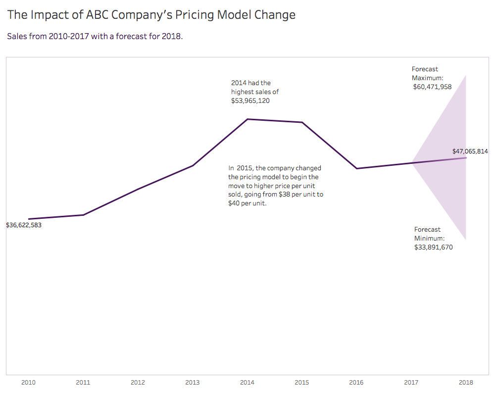 Care should be taken to avoid over-annotating. The best way to avoid that is to ask, "Do we really need that additional information?" In the above example, there be opportunity to remove an annotation, which should discussed in the vetting session. To read more about the making of this annotated line graph, click here.
1 Comment
|
Emily KundHelping people and organizations begin their data visualization and Tableau journey. I'm a fan of training, Tableau, data viz, my kids, cupcakes, and karate. Archives
January 2023
Categories
All
|
 RSS Feed
Proudly powered by Weebly