|
While I haven't regularly participated in Makeover Monday in the past, I found this week's topic to be quite interesting. Partially because as a mother, parental leave affected me. This week, I decided to visualize the story that stood out to me. The other reason why I wanted to participate in this week's Makeover Monday is because I visualized similar data when I made over data from a Huffington Post article on maternal leave in 2014. This was a meaningful reviz for me, because not only do I get to tell the story I found in the data but it also gives me the opportunity to compare my 2018 work to the 2014 work. 2014 Huffington Post RevizitThe following image is from a 2014 Huffington Post article which inspired me to see how I might visualize this data. 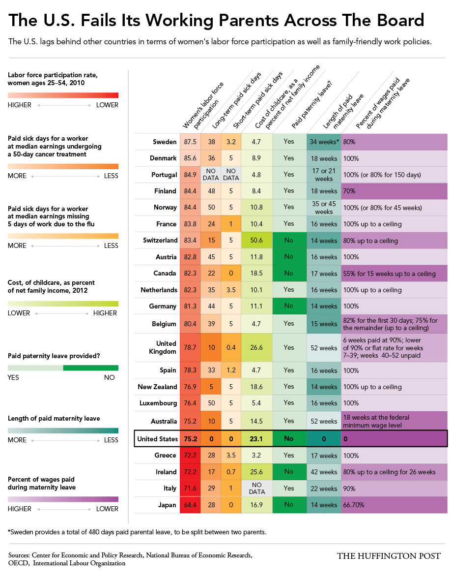 I originally used the story points in Tableau to visualize this data on paid maternal leave with a bar chart. 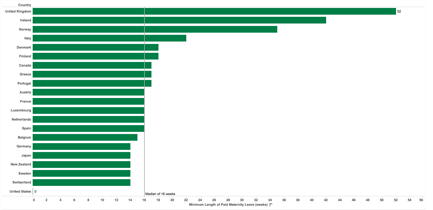 Four years later, here's how I visualized similar data (parental leave instead of maternal leave). 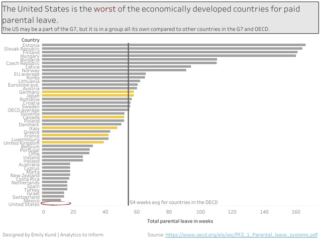 The Deltas
The Similarities
Looking at this chart a few days after I made it, I can definitely see some things I want to change or tweak. Maybe I'll visualize it again in four years to see what's changed in the data and my design.
1 Comment
With my banking background, I am fascinated by cryptocurrency. I discovered this comparison between Visa and PayPal and cryptocurrencies for processing transactions per second. Before I share my visualization, I want to share my observations about this visualization. 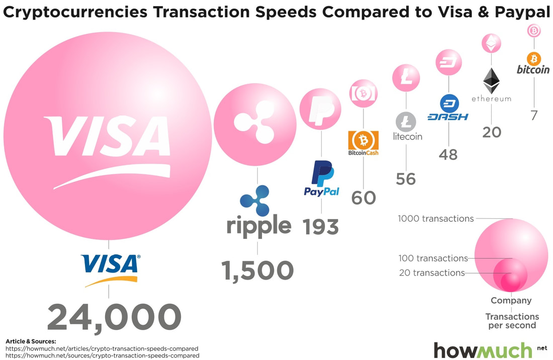
As I set out to reviz this chart, there were a few items that were top priority for me; changing the chart type to one that is more effective (in my opinion), changing the color scheme, and modifying the label use. I found this image online and thought it had a great color scheme with the dark background and the light blue/teal that makes the individual images pop, which is what I wanted to carry over to the visualization.  The following visualizations provide a focus on the data. The first provides a focus on the comparison whereas the second provides a total to really show how few cryptocurrency transactions are processed per second compared to VISA. Additionally, the color scheme of the original visualization felt very bubble gummy to me and the shine on the bubbles is not an effective way to visualize data as it interferes with the readers' ability to comprehend the message the data is telling.  The above is an example of data visualization, whereas the following leans more toward visual analytics because of the conclusion on top of the pie chart. There are a lot of mixed feelings about pie charts. Some people despise them, some people love them. For me, I'm a believer of the best chart type for the data. In the example below, I believe a pie chart is an appropriate chart to show the relationship between the volume of cryptocurrencies and traditional payments. Additionally, by reading the title of the pie chart, one can understand that the bigger volume is related to traditional (and primarily VISA). 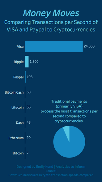 Project revizit complete! The visualization was really for me (though I did contribute to the monthly Storytelling with Data Challenge), and I am pleased with the first and second iterations. Looking for someone to help you revizit your visualizations? Analytics to Inform can help. Contact us to learn more how we can be of service.
I really enjoyed the slopegraph challenge from Storytelling with Data, that I decided to tackle the first challenge Cole of SWD issued--the annotated line graph. You can read about the annotated line graph challenge here. I made up some data to visualize...this time it was sales data for a magical widget. 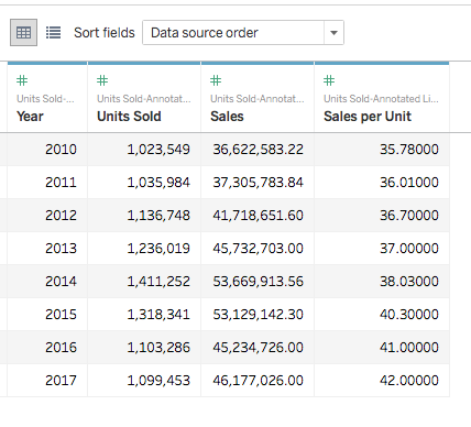 Then it was time to visualize. First was the line graph, since that was the basis of this challenge. 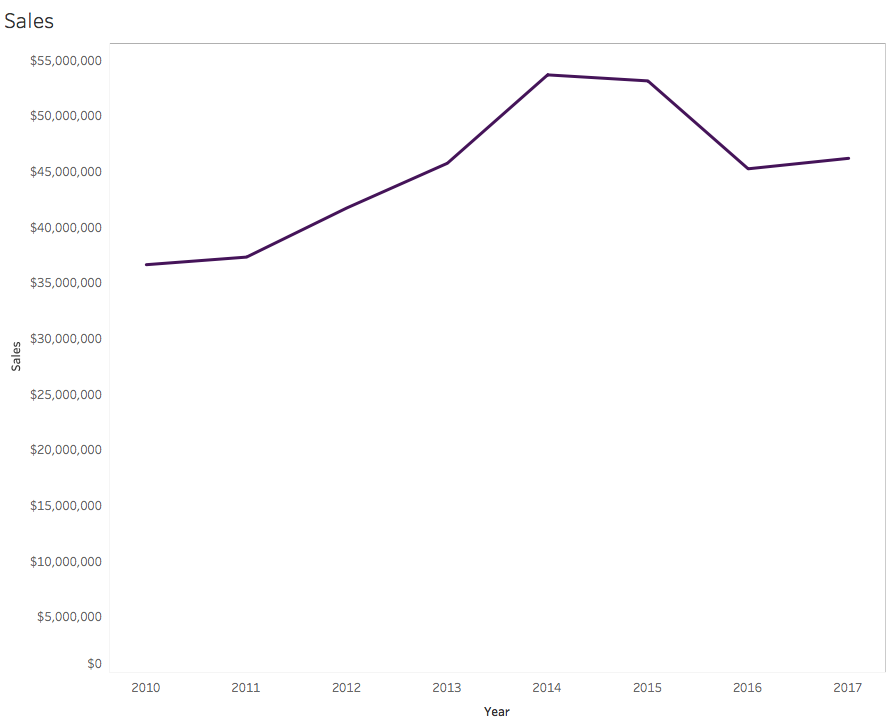 There are so many formatting and annotation opportunities here. When first looking at the visualization, a few things came to mind.
 Annotation and Format Changes
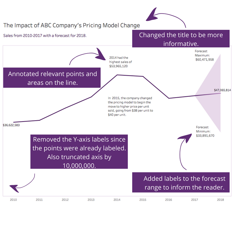
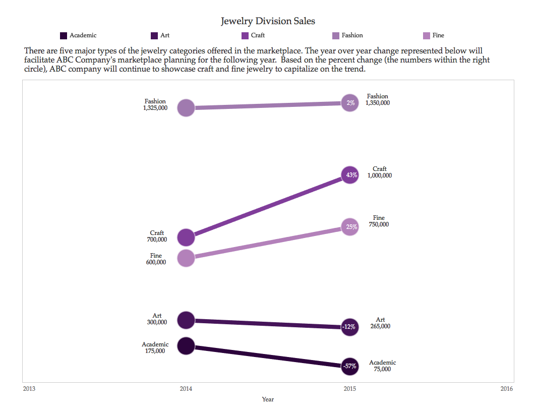
The resulting visualization follows. 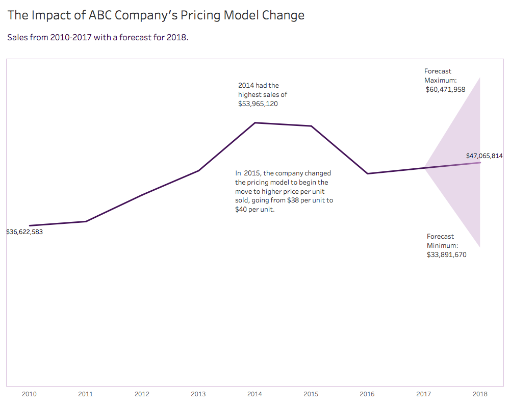 In my article titled "See the Difference with Slopgraphs" which you can read about here, I show the difference between the data and the visual and how much easier it is to see the information. That's the point of data visualization. After I reviewed the data, then I made a decision. I concluded on the next steps on where to focus in my pretend ABC company. That's the part I love; using data viz to make well-informed decisions. But how do I get here? It took a few iterations. In this post, I'll share the major milestones from data to viz with a little text along the way. The Data Lately, I've been making up data to use as I practice sharpening my skills. I do this for two reasons.
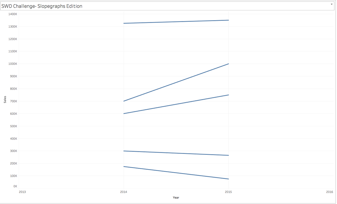
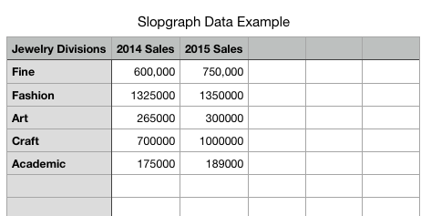 The trouble is, when I go to put this in Tableau (and likely any other BI tool), 2014 and 2015 are separate data items. And in Tableau, they are visualized that way and that's all wrong for what I'm trying to show. You can see what it looks like in Tableau's data source window in the image below. Also note, that I have a lot of nulls? Tableau has read the shaded areas from numbers/csv as columns and rows where data should be, so it brings it over, but because there are no values, I get null. If you run into this, my favorite trick to clean it up is to use data interpreter, it narrows it down to the just the data. 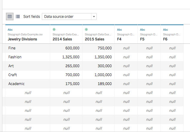 Since this was not going to work for me, I fixed my data. To me, this isn't as intuitive, but tall data works. 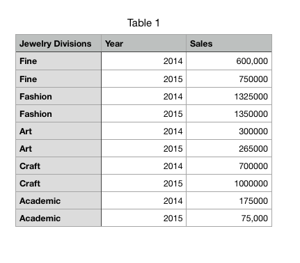 Here's what it looks like in Tableau in the data source window. 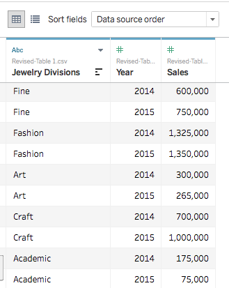 As mentioned at the start, my goal was to make a slopegraph. When I started to visualize it, this is what the original slopegraph looks liked. I used Ryan Sleeper's tutorial to refresh my memory since it had been awhile since I used this chart type. 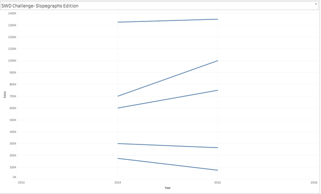 That's a start, but there is no information on the right side to show what it changed to. So, the next step was to label the lines so that I could see the change. I also changed the color (using colors from my custom Pretty Strong Smart palette), changed the typeface (so it was more jewelry-looking), and changed the size of the lines/slope. You can see what my Tableau canvas looks like in the screenshot below. 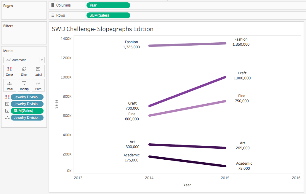 This meets the requirements of a slopegraph but it didn't feel right. Ryan's tutorial was for a dual-axis slopegraph, which I think looks nicer. Maybe it's just me, but the circles give the slopegraph a finality to it (like punctuation to a sentence). So the next major step was to make this a dual-axis slopegraph. 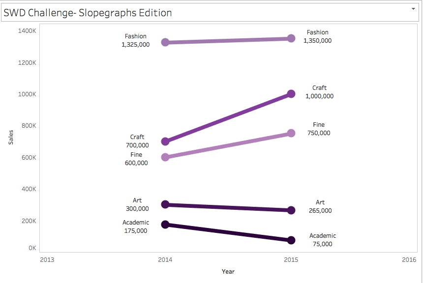 After feeling great about doing a dual-axis slopegraph, my next thought was ,"Why make my audience work for the percent change?" Having worked in retail years ago, it felt like I lived and died by the YoY or percent to plan metric. So I make the circles a bit bigger, labeled them, and then moved the labels to the center(ish) of the circle. 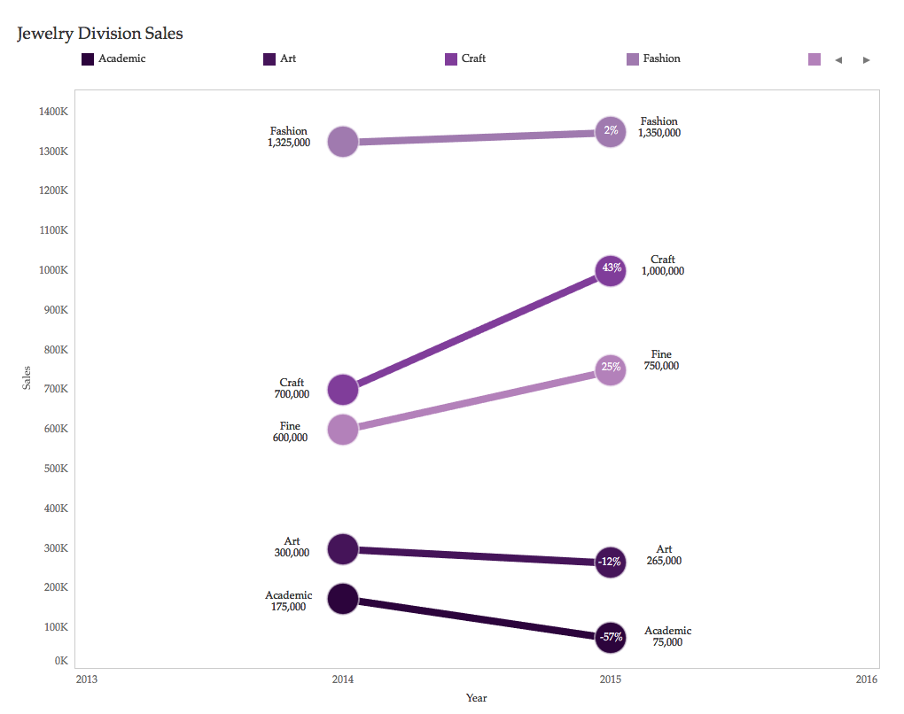 I tweeted this out and was pretty happy with my results, which didn't take a lot of time. And then Cole responded and suggested I remove the Y-axis since I have the points labeled. Where is that face-palm emoji? A little detail I didn't think of, but was completely right. Doesn't the picture below look much nicer and cleaner than the one above? 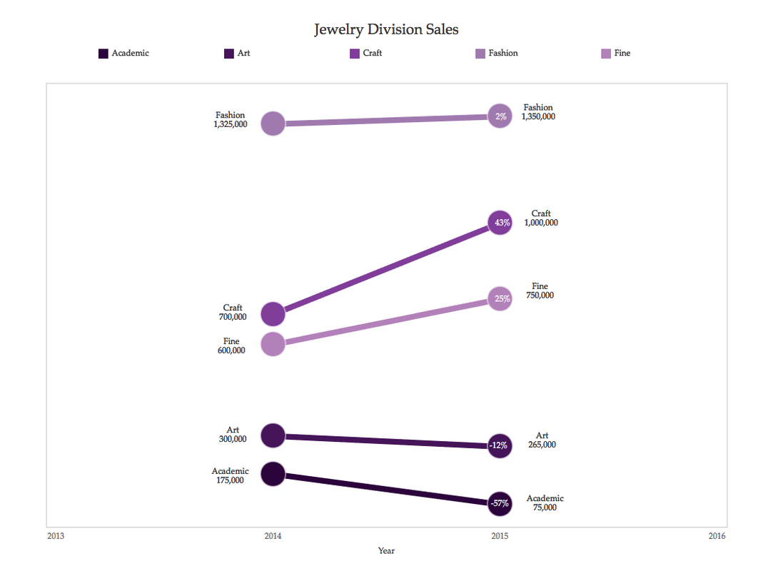 If visual analytics is my jam, I wanted to provide a conclusion to go with this data set for the imaginary Board at my imaginary ABC Company. This is just one way where a little text can help supplement the visualization. In this particular case, I also added a little text so that people viewing the visualization for the challenge had a little more context.  Retaining the iterations was a great exercise to go back and see the turning points in the visualization. I love how the data has transformed, as recapped below. |

 RSS Feed