|
While I haven't regularly participated in Makeover Monday in the past, I found this week's topic to be quite interesting. Partially because as a mother, parental leave affected me. This week, I decided to visualize the story that stood out to me. The other reason why I wanted to participate in this week's Makeover Monday is because I visualized similar data when I made over data from a Huffington Post article on maternal leave in 2014. This was a meaningful reviz for me, because not only do I get to tell the story I found in the data but it also gives me the opportunity to compare my 2018 work to the 2014 work. 2014 Huffington Post RevizitThe following image is from a 2014 Huffington Post article which inspired me to see how I might visualize this data. 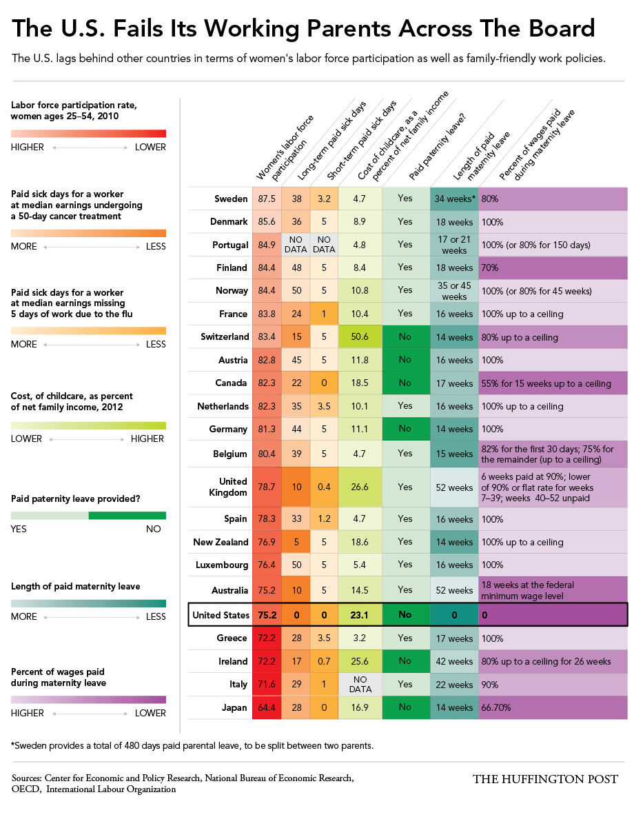 I originally used the story points in Tableau to visualize this data on paid maternal leave with a bar chart. 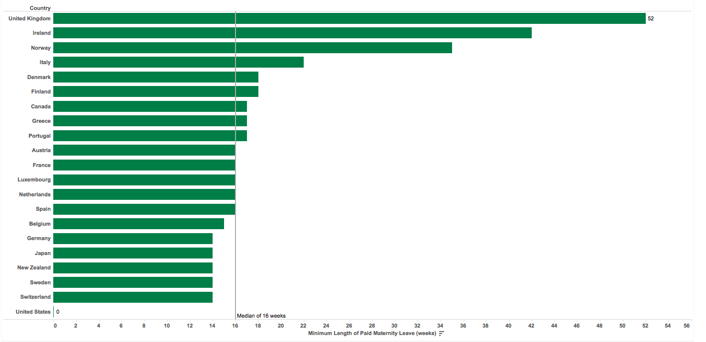 Four years later, here's how I visualized similar data (parental leave instead of maternal leave).  The Deltas
The Similarities
Looking at this chart a few days after I made it, I can definitely see some things I want to change or tweak. Maybe I'll visualize it again in four years to see what's changed in the data and my design.
1 Comment
7/10/2019 09:27:15 am
Being a parent is hard, especially when you have a career that you are working on. It is easier to live life without a kid, but I would not change what I have right now. While it will be easier, I still cannot think of a life where I do not have my kids with me. Sure, my career might be in a different trajectory right now, but what is my career if I do not have a family with me. Parenthood is the greatest success that I can wish for. Leave a Reply. |
 RSS Feed